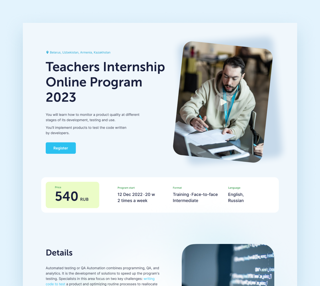
Some courses are actively advertised on social media. Therefore, the course page is often the starting point for exploring the training portal
After starting work, I did a heuristic analysis and collected statistics.
Many problems were identified when studying user feedback and communicating with the HR and marketing team, as the platform is their main work tool

Statistics have shown that only 9% use the mobile version. Users' fitbacks also said that it is impossible to use the portal from mobile devices
After talking to the HR team, a significant problem was identified: a large number of irrelevant requests were received
The marketing team was concerned outdated service design, which had a particularly negative impact on brand positioning
Due to limited time, I was unable to conduct full interviews, so I decided to use proto-personas.
The research conducted by the marketing and HR team became the basis of the work. This allowed us to focus on users' needs and better understand their motivations


Competitor analysis helped us find out what to look for in the product and what the existing solution lacks

Users spent on the portal just over 2 minutes, but they crossed more than 4 pages. For me, this was a signal that they were trying to find information, but they did not find it and were leaving
The services describe course programs in detail, which helps build trust in them
Designing a course page as a landing page allows you to attract users from social networks and work with their objections without leaving the page, thereby increasing conversions
Storytelling is an important component; it is necessary to answer users' questions before they become critical and lead to a departure from the service
During the study, I also found that research was conducted on the Russian market in this area, and the data from this study later helped to put the right emphasis on storytelling

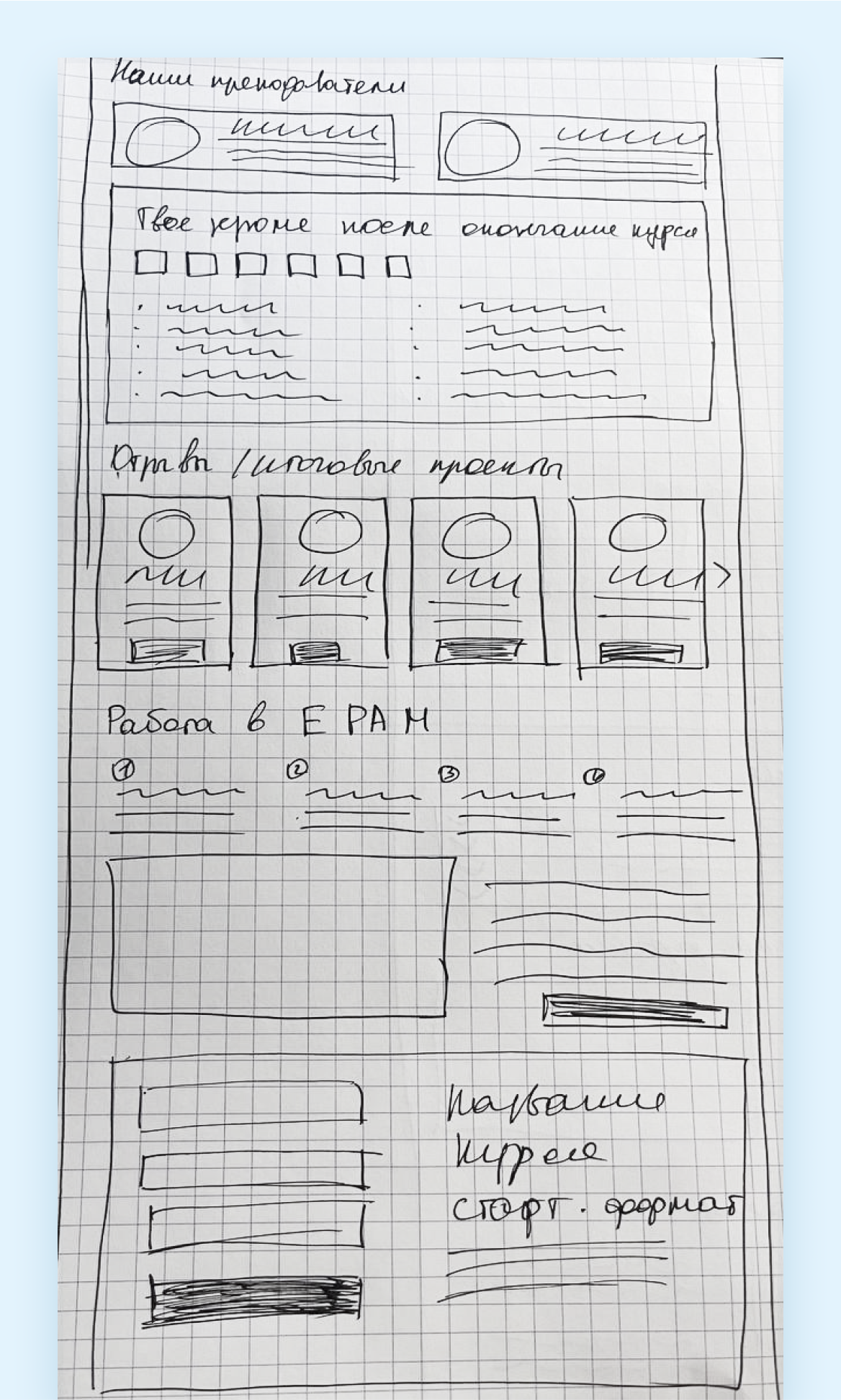
After creating the page structure, I started prototyping. I often just use pen and paper

The next step was to create a visual style for the service.
I brainstormed with colleagues to develop concepts that needed to be visually validated. Since the audience is young, I tried to create an image of a mentor who is careful and gradually leads students to the goal
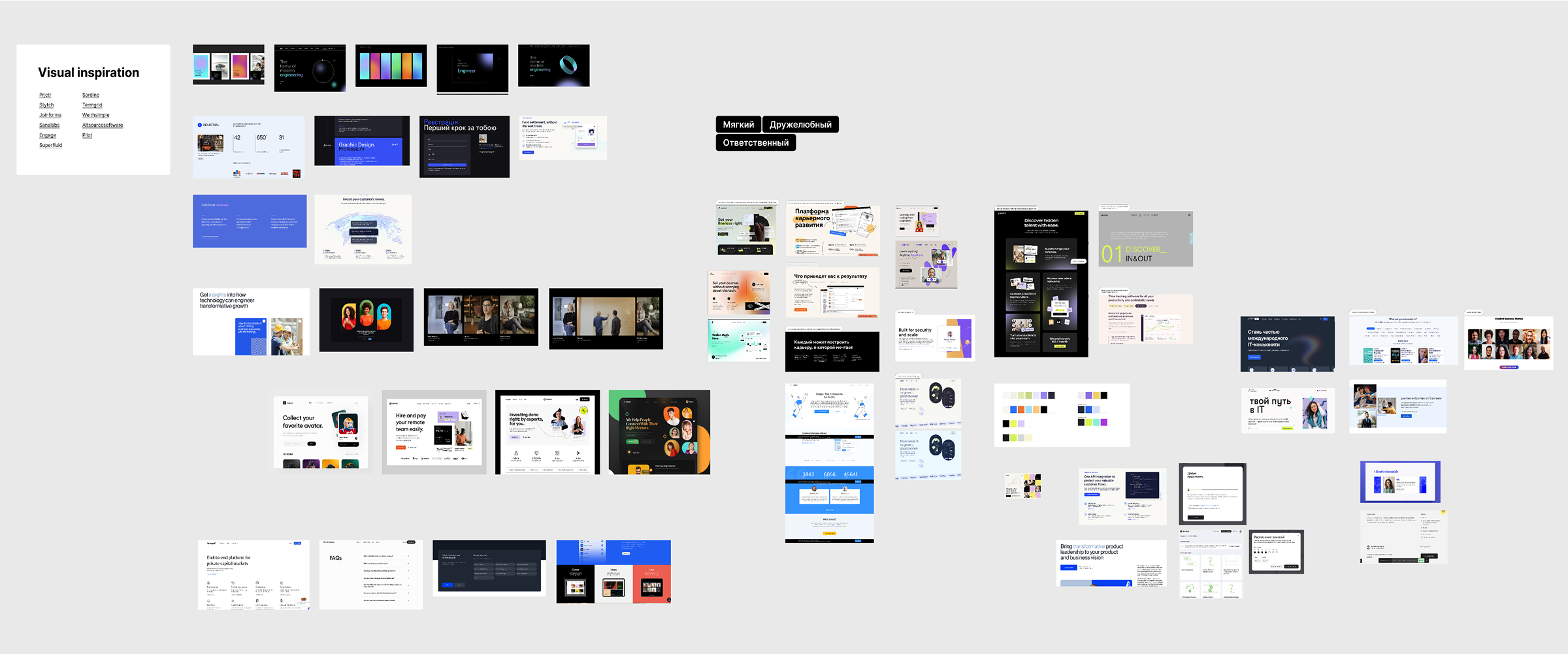
Then I conducted a visual research. I highlighted the parts that I like and would like to see in my concept. I decided on the color, chose not to depart from the existing branded blue, just made it brighter and more contrasting
The concept development phase was quick and easy thanks to the previous steps
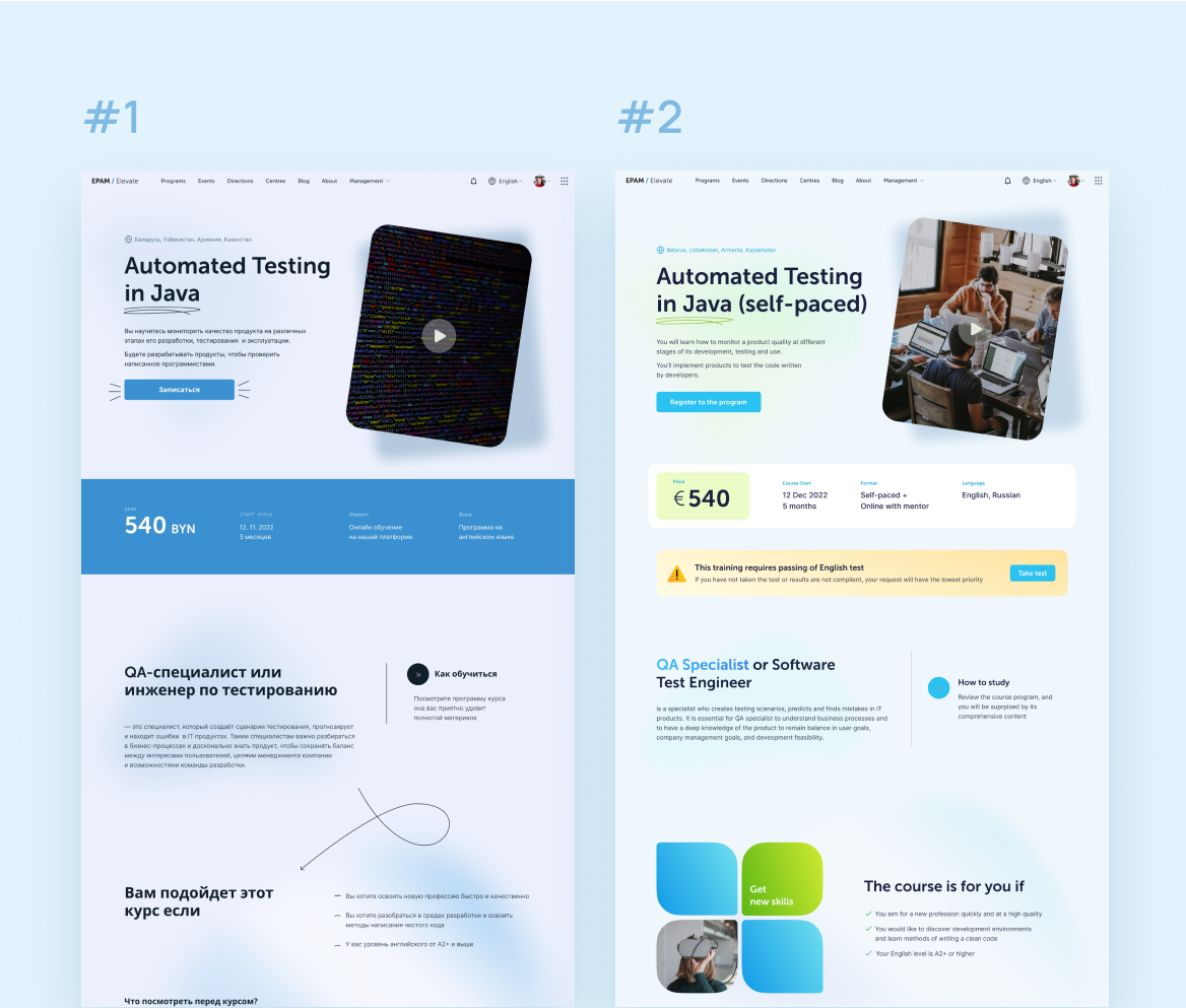
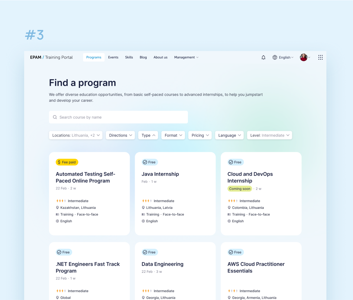
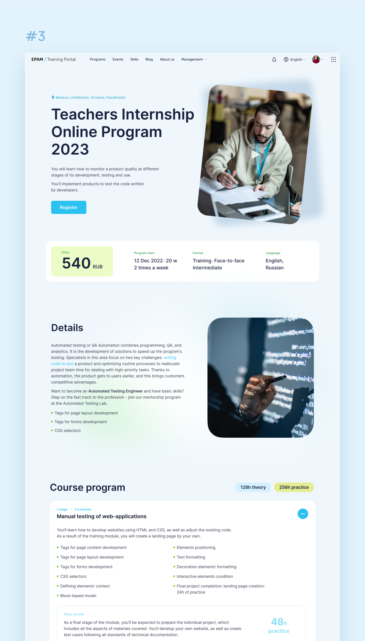
After developing the course page and home page, unmoderated test was conducted, where 163 users were shown the old and new versions of the service.
78% of users chose the new design and noted that it was more attractive.
The user's path to a particular course was also tested, and in the new version, the user achieved his goal faster due to the fact that the main page did not display the entire list of courses, but was divided into levels
No redesign presentation to a team attached to the old look ever goes smoothly, but after a few iterations and discussions, we aligned on a shared vision. The visuals didn't change much after those meetings—they just felt more familiar to the team.
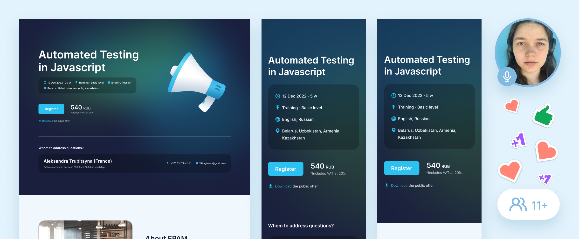
During my design work, plans shifted. Instead of building on a new backend as originally intended, we had to start the redesign using the old one.
This made implementing our vision much trickier, so we cut it into iterations—starting with elements compatible with the legacy backend, then tackling critical blocks, and prioritizing from there. All while ensuring the storytelling quality didn't suffer.
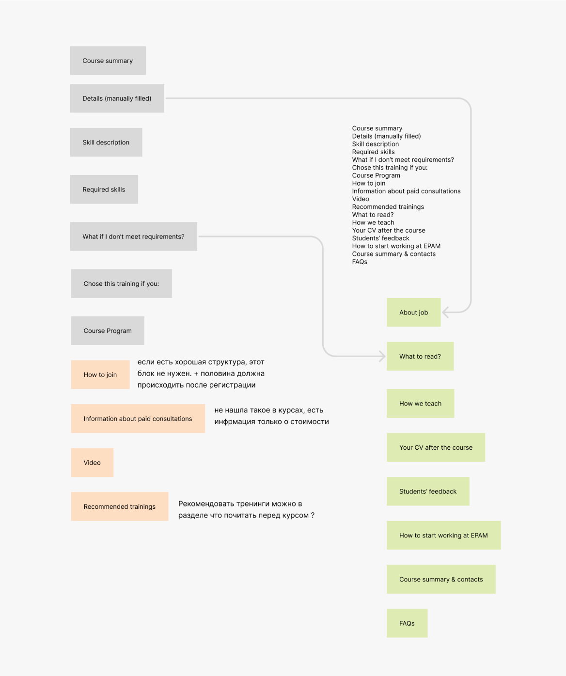
Working closely with marketing and dev teams, we defined a streamlined page structure and agreed on how to migrate content from existing courses into the new visuals.
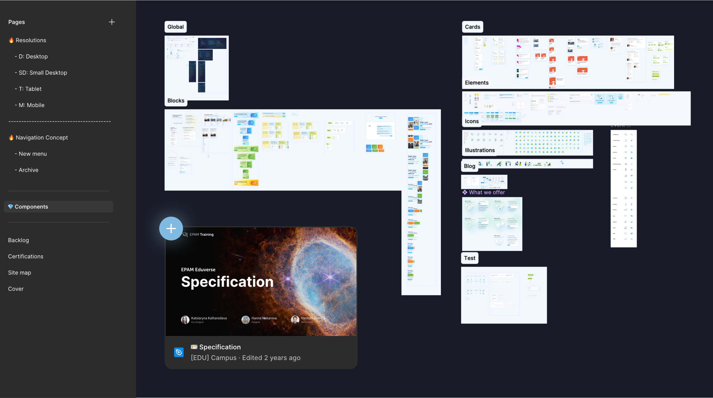
After finalizing all corner cases, documentation for developers was prepared, and also a design was presented